
A coffee brand website should express the brand's character and help people choose a coffee they understand. Before discussing colours or animation, decide who the site serves, what they need to know about the range and how they will get their coffee.
A roaster supplying cafés has different priorities from a business selling bags to home brewers. A café with a small retail shelf may need opening hours and directions alongside its coffee information. These journeys can share one identity while giving visitors clear routes.
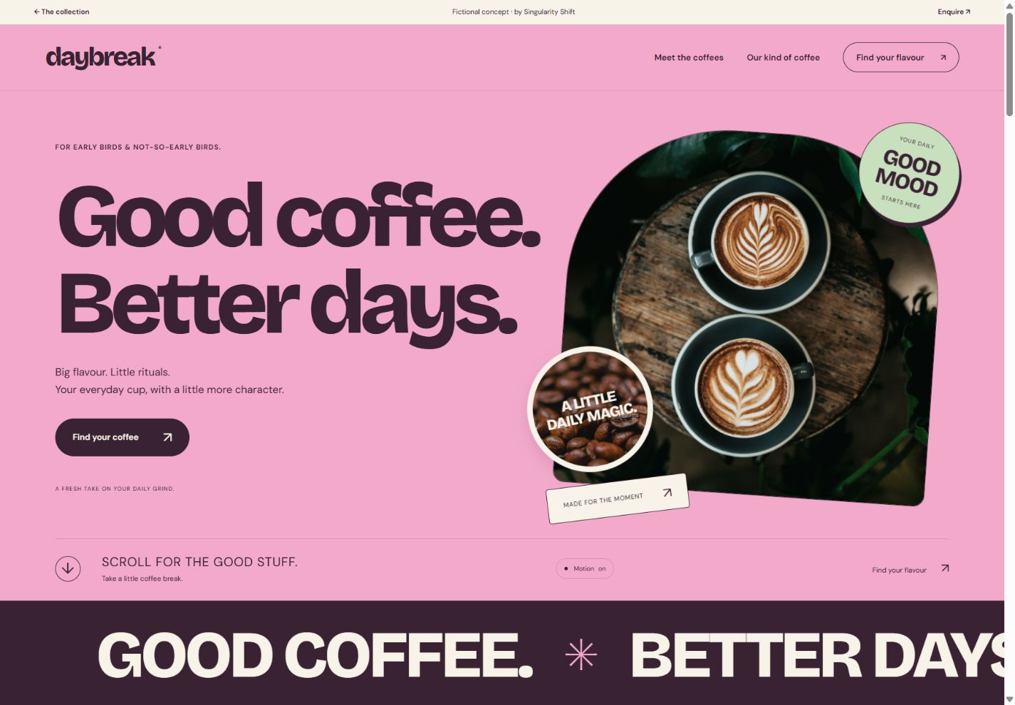
DAYBREAK is a fictional coffee website concept that explores the product-discovery part of this problem. Its coffees, flavour profiles and brand story are illustrative. The working finder, filters and tasting list demonstrate possible interactions; the demo does not take orders or payments.
See the idea in action
DAYBREAK
Explore layered coffee imagery, a flavour finder and a personal tasting list.
Original concepts for fictional brands, created by Singularity Shift.
Build the range on paper first
For each real coffee, gather the facts that distinguish it. A useful starting record includes its name, available format, bag sizes, taste description, brewing suggestions and decaffeinated status. Add origin and processing information where you can substantiate it.
Keep those facts consistent wherever the coffee appears. If a product card describes a coffee as decaf, the finder and detailed description should agree. If the range changes seasonally, decide who will update recommendations when a coffee leaves the catalogue.
Taste descriptions need to suit the audience. Some customers enjoy detailed tasting notes; others want a straightforward answer about whether a coffee is bright, mellow or comfortable with milk. You can offer a short explanation first and fuller information when someone wants it.
For a hypothetical Cheltenham roaster serving both home brewers and local cafés, this could mean separate routes for choosing a bag and discussing wholesale supply. The website should make the distinction visible without requiring visitors to understand the business's internal terminology.
Give browsing and guided choice their own roles
DAYBREAK provides both a line-up and a finder. Someone who knows they want decaf can filter the coffees directly. Someone less certain can choose a brewing method and a flavour preference.
The demo's flavour choice selects among The Daily, Bright Side and Slow Sunday. The brewing choice changes the explanation of how that recommendation fits the visitor's routine. It is a small set of explicit rules, with no AI service or hidden personal profile.
A real finder needs similarly clear reasoning. Write out the questions, possible answers and recommendations before building the interface. Then check combinations that are awkward: a preference with no suitable product, an unavailable recommendation or a visitor who wants to browse everything anyway.
Keep the questions proportionate to the range. If three coffees can be explained clearly on one screen, a long quiz would ask for effort without adding much information. The product finder guide covers planning the decision rules.
Say exactly what saving means
DAYBREAK's tasting list lets visitors add and remove coffees while exploring. It holds the selection in the current page's memory and clears when the page is reloaded. It does not create an account, reserve products or submit a request.
For a live site, decide what a saved list is for. A customer might want a reminder for a shop visit, a shareable selection or a starting point for an order. Each purpose needs different behaviour and wording.
Make the result explicit. If someone expects to come back tomorrow, a list that disappears needs clear labelling or a different implementation. If it becomes an enquiry, decide which details accompany it and who receives them. A button labelled “Save” should not leave the visitor guessing.
Create an identity with material you can support
DAYBREAK's pink, mint and plum palette, large lettering and coffee imagery set an approachable tone. Its layered opening and photographic scroll sequence give the brand room to express the pleasure of an everyday ritual.
For your own business, start with real packaging, the product, its preparation and the people or place behind it. Plan photographs for both close inspection and wider compositions. A bag photograph that works on a product card may not have enough space around it for an opening headline.
Reference photography can help explain an early direction. Before publishing, be precise about what an image represents. Do not imply that an unrelated roastery, grower or café belongs to your business. DAYBREAK explicitly credits its illustrative photographs and does not present them as a real supply chain.
Our brand storytelling guide explores how to connect those materials into a coherent journey.
Decide how customers actually buy
Product discovery is one part of the website. A real sales journey also needs the available products, prices, fulfilment arrangements and a way for the business to handle orders.
If you offer collection, explain the location and when a purchase will be ready. If wholesale enquiries are the priority, ask for useful context such as the type of venue and the supply being discussed. Avoid sending both audiences into an unexplained general form.
Subscriptions, repeat orders and online checkout are further decisions. Scope them around the business you can operate, using the ecommerce planning guide to identify the work behind the product pages.
Bring a useful first brief
Gather three representative coffees, your current packaging, a few customer questions and the intended route to purchase or enquiry. Note which information changes regularly and who will maintain it.
For website design and development in Cheltenham, I can shape those materials into a distinctive coffee website with useful discovery. Describe your range and how you sell it, and we can establish what the first version needs to do.