Parallax website design can give a page a sense of depth by moving visual layers at different speeds as someone scrolls. A photograph might move behind a heading, or a foreground detail might travel faster than its background.
Other effects often described as parallax work differently. An image can expand from a narrow frame, a section can remain in place while its contents change, or photographs can stack over one another. Each creates a particular rhythm. The useful question is what that rhythm helps a visitor notice or understand.
For a Cheltenham business considering a more distinctive website, start with the story and the customer task. Then decide where movement belongs.
See the idea in action
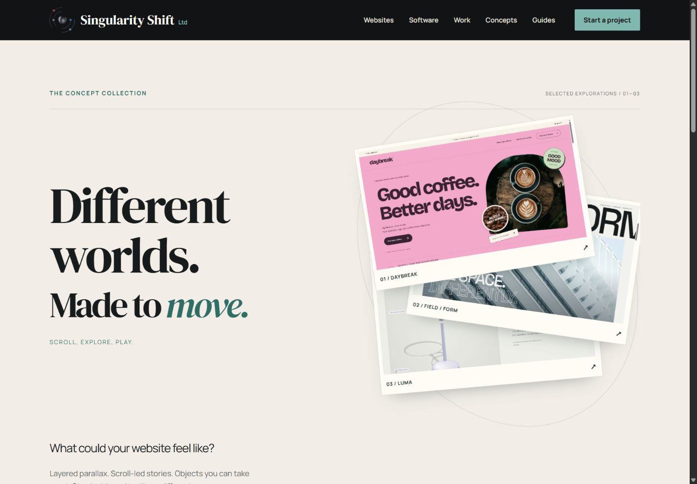
The concept collection
Compare three different website experiences and see the design decisions in action.
Original concepts for fictional brands, created by Singularity Shift.
Give the effect one clear job
Motion becomes easier to judge when you can explain its purpose in a sentence. For example: the opening should reveal the proportions of a space; the sequence should explain three steps in a process; the product image should draw attention to a specific detail.
A design-led practice may want visitors to pause over materials and composition. A specialist maker may want to introduce a product through a short sequence. In both cases, a focused scene can give the material a deliberate presentation.
Keep practical information easy to reach. Someone returning for opening hours, a specification or a contact link may already understand the brand. Their route should remain straightforward even when the first visit offers a more expressive introduction.
Look at a working sequence
The interactive design collection gives you several directions to explore. In FIELD / FORM, the oversized masthead separates as a narrow photographic frame opens across the screen. Later, three photographic sheets slide and settle over one another.
These are different techniques serving a shared theme: changing how a visitor sees a space. The opening uses scale and framing; the later sequence gives light, nature and quiet their own moment.
The studio and briefs are fictional, and the real photographs are credited references. The concept demonstrates a design direction rather than a reported client result. A commercial site would need its own content, a suitable level of movement and review against the tasks its visitors actually need to complete.
Decide how much of the page should move
A short, memorable opening often gives enough room to establish an identity. The rest of the page can then settle into clear reading, comparison and enquiry.
Consider the total distance someone must scroll. A pinned scene stays in view while several screenfuls of scrolling change its content. That can support a visual sequence, but it also adds a commitment of time and attention. Ask whether the scene deserves that much space in the journey.
An effect should have a clear entrance, purpose and exit. Check what happens when someone scrolls quickly, reverses direction or follows a link directly to a lower section. The page should still feel like a coherent document.
Include a quieter presentation in the design
Some visitors need or prefer less movement. W3C identifies parallax and other non-essential motion triggered by scrolling as potential difficulties for people with motion sensitivity. Its guidance supports allowing that additional motion to be disabled. W3C: Animation from Interactions.
Ask to see the quieter version during design review. It should retain the photographs, explanations and useful controls in a sensible order. The accessible website animation guide covers what to put in the implementation brief and how to review the result.
A phone also deserves its own composition. A movement that feels restrained on a wide desktop can fill a small screen. Shorter travel, fewer overlapping layers and a simpler sequence may suit the same idea better.
Account for the material behind the effect
Motion exposes weaknesses in the assets. An enlarged image may reveal softness; a moving crop may cut off the feature you intended to show; a title may cross from a dark area into a bright one.
Review the effect with representative photographs and real headings before approving it. Include the longest likely project name and a portrait image as well as an ideal landscape shot.
Implementation choices matter too. Properties that cause repeated layout or painting can make animation more expensive for the browser. Google's animation performance guide explains why developers consider those costs. The business requirement is simpler: the scene should remain responsive on the devices agreed for the project, with evidence from actual testing.
Make future changes part of the brief
Decide who will update the scene and how often. Replacing a photograph should not unexpectedly hide its subject or make an overlaid heading unreadable. If the effect depends on tightly art-directed assets, record the crop, dimensions and composition needed for a replacement.
Ask the developer which changes are routine and which need a design review. A regularly changing campaign may need more flexible layouts than a stable brand introduction.
Review one scene before extending the approach
A useful first brief names the audience, the message, the source material and the action that follows the scene. Agree a working prototype with a normal-scroll experience, a phone layout and a reduced-motion version.
Review whether someone can explain the offer, reach relevant details and make an enquiry. Visual interest earns its place when those tasks remain clear.
For website design and development in Cheltenham, send James the idea you want to communicate and a few examples of movement you like. We can identify a focused effect and judge it against the needs of the whole page.