
Someone looking at a restaurant or cafe website may be deciding where to go in the next hour. They need to establish whether the menu suits them, whether you are open, where you are and whether they should book. Making those answers easy to find is a good starting point for the design.
For a Cheltenham venue, the website must work for both familiar customers and people planning their first visit. Local knowledge should not be required to understand an entrance, a collection point or the difference between kitchen hours and the time the doors close.
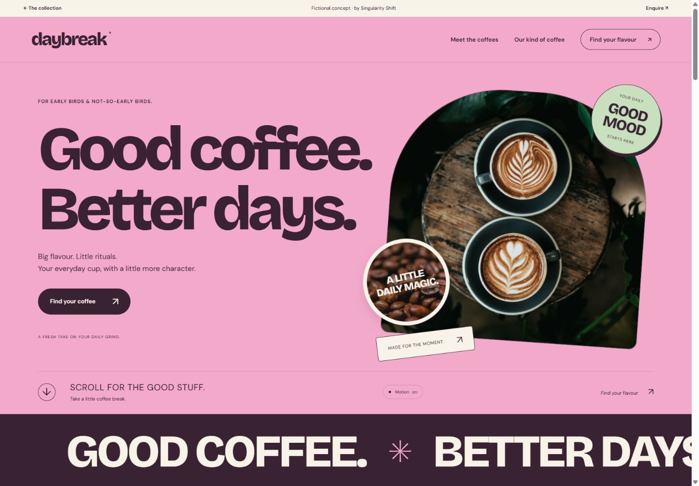
See the idea in action
DAYBREAK
Explore layered coffee imagery, a flavour finder and a personal tasting list.
Original concepts for fictional brands, created by Singularity Shift.
Put the menu where people can read it
A menu should be accessible from the main navigation and readable on a phone. Give guests useful menu text on the page; if you also provide a downloadable version, make it an additional option.
Organise dishes in a way that matches how you serve them. A lunch offer, evening menu and takeaway menu may need distinct sections. Explain when each is available. If menus change often, assign someone to make updates and agree what happens when a dish is unavailable.
Avoid decorative text embedded entirely in large images. It can be awkward to enlarge, search or keep current. Attractive food photography can support a menu without carrying all of its information.
Where dietary information is provided, keep it accurate and consistent with the venue's actual process. Give customers a clear way to discuss their requirements with the team. Do not use the website to make blanket suitability promises that the kitchen has not confirmed.
Separate opening hours, food service and booking
These are related questions, but they are not always the same question.
A cafe might open before its full menu starts. A restaurant could accept bookings until one time while the kitchen closes at another. Special events or private hire may change the normal pattern. State the details where a guest is likely to need them.
If you use a booking provider, make the handover clear. The button should lead to the correct venue and useful booking screen. Test what happens when a preferred time is unavailable, when a group is too large for online booking and when someone wants to change an existing reservation.
Do not describe a contact form as a reservation unless submitting it actually reserves a table. A booking enquiry needs a different confirmation message.
Make arrival straightforward
An address and a map link are the basics. Helpful detail can include the correct entrance, whether takeaway collection uses a different door, and factual information about access.
Write what you know rather than using vague assurances. For example, describe steps at the entrance or where a guest can contact you to discuss access. Only mention parking arrangements that genuinely apply, and make clear whether parking belongs to the venue or is elsewhere.
Keep important information close to the address rather than hiding it in a long frequently asked questions page. Visitors should be able to plan without sending three separate messages.
Example: a lunchtime visit with two different needs
Imagine two friends choosing a cafe in Cheltenham. One has a short lunch break; the other wants to check whether a particular dietary requirement can be accommodated. This is an illustrative scenario, not a client story.
They open the lunch menu, see the service times and find a clear route to ask the cafe about their requirement. The address section explains the entrance. If the cafe takes bookings, the site explains how; if it operates as walk-in only, it says so.
The website has helped them make a practical decision. A full-screen food video would not have answered those questions on its own.
Decide who owns each update
Menus, seasonal opening times and booking links should have named owners inside the business. You do not need a complicated publishing system, but you do need a reliable update process.
Ask your website designer to demonstrate the changes you expect to make most often. Adding a new dish should not involve rebuilding the page. A temporary closure should not remain hidden below last year's promotion.
If gift cards or retail products are part of the offer, the guide to independent shop websites can help distinguish an online purchase from a simple product enquiry.
Give the brand character without hiding the visit details
The DAYBREAK coffee concept shows one possible visual direction: confident lettering, layered coffee photography and a playful scroll sequence. It is an original fictional brand, with a flavour finder and tasting list rather than a working venue booking or online shop.
For a cafe, those ideas could support a clear menu, address and opening hours. A roaster selling beans might instead lead customers towards brew methods and flavour preferences. Decide which business journey you need before borrowing the visual style. The coffee brand website guide explains that distinction and what to include in a design brief.
A useful pre-opening website check
Run through this checklist before promoting the site:
- Read the current menu on a phone without zooming.
- Compare published prices and service times with what the team is using.
- Try a normal reservation and an unavailable time.
- Confirm that enquiry forms explain whether a booking has been made.
- Check the address, directions and genuine access information.
- Assign responsibility for special opening hours and menu changes.
My Cheltenham website design service starts with what guests need to do. Send me your current menu and booking setup, along with the questions your team answers repeatedly, and we can shape a website around those decisions.