
The most useful website design example is one you can explore. Look at how it introduces a business, try its controls and follow the route to the next step. That gives you more to discuss with a developer than a screenshot and a preferred colour.
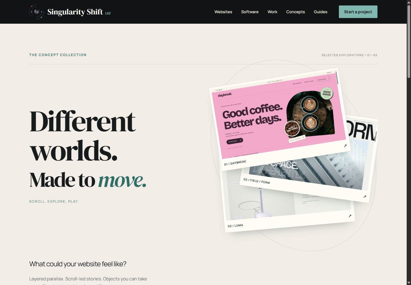
The Singularity Shift concept collection contains three working examples: an independent coffee brand, an architecture studio and a lighting product. All three businesses are fictional. They demonstrate design and interaction choices; they are not commissioned client projects or evidence of commercial results.
If you are planning a website in Cheltenham, use them to identify what your own customers need to understand and do.
See the idea in action
The concept collection
Compare three different website experiences and see the design decisions in action.
Original concepts for fictional brands, created by Singularity Shift.
Three examples, three different jobs
DAYBREAK: help someone find a preference
DAYBREAK uses oversized lettering, pink and mint colours, coffee photography and a scrolling story about a daily ritual. Its visual character is informal and expressive.
Further down, the coffee finder asks about brewing and flavour preferences. The visitor receives a recommendation from three fictional coffees, with an explanation adapted to the selected brewing method. They can also filter the line-up and keep a tasting list during their visit.
The useful question for your business is whether customers need help choosing. A small product range, an unfamiliar service or several workshop options might benefit from a similarly short decision process. The coffee theme is only one way to express it.
The demo has no stock system, orders or payment. Those would be separate requirements for an actual retailer.
FIELD / FORM: let people examine the work
FIELD / FORM puts architectural photography and spacious typography at the centre of the page. Visitors can select three fictional project studies, open their briefs and move a control to compare colour and monochrome views.
The comparison shows two treatments of the same photograph. It is not a renovation before-and-after, and the photographed buildings are not attributed to the fictional studio.
That distinction matters when considering a portfolio. An architect, interior designer or maker needs to establish both visual quality and the facts behind the work: what was commissioned, who contributed and what was completed. The interaction is useful when it encourages a closer look at something worth explaining.
LUMA: explore the object and its options
LUMA introduces an imagined table lamp through a 3D viewer and a small set of controls. Visitors can rotate the lamp, choose a finish and silhouette, adjust its displayed brightness and keep a combination in their browser.
On suitable larger screens, scrolling also reveals an exploded view of the object. The parts separate and come together as the surrounding text develops the story.
This direction is relevant when form or configuration is central to the product. A person considering a lamp may want to see its shape from another angle. A local furniture maker may need visitors to compare a finish or understand an assembly detail. Each interaction should answer a specific question.
Borrow the principle that fits your business
You do not have to choose an entire example unchanged. A restrained portfolio could use a short finder. A colourful brand might need simple product photographs rather than a 3D model.
For a hypothetical Cheltenham ceramics studio, a useful brief might combine close-up photography, a clear distinction between ready-made and commissioned pieces, and a straightforward commission enquiry. The central task would be understanding the maker's work and asking about a suitable piece.
For a coffee roaster, the brief might focus on explaining blends and helping home brewers choose. For a product designer approaching trade buyers, dimensions, options and downloadable information could deserve more attention than a dramatic opening scene.
Write down the reason you like a feature. “I can compare the options without losing my place” is a more actionable observation than “I want something modern.”
Review an example in ordinary use
Spend a few minutes with each relevant demo on a phone as well as a larger screen. Try to find a specific item rather than simply scrolling from top to bottom.
- Can you explain what the business offers after the opening section?
- Are the words and photographs useful at a smaller size?
- Can you recognise and operate the main controls?
- Does each interaction lead to understandable information?
- Can you reach the next step without watching the whole visual sequence?
- Does the page still make sense when extra motion is switched off?
A concept can demonstrate an approach without settling every requirement for a live business. Ask what is already functioning and what still needs content, integrations or operational decisions.
Turn your observations into a brief
Choose one or two reference features and explain what you want them to help with. Add your actual material: sample products, representative projects, existing brand assets and the questions customers regularly ask.
Identify the first release's main action. It might be a project enquiry, a visit to your premises, a product comparison or an order. These involve different content and development work, even when their opening pages look similar.
The guides to coffee brand websites and interactive product websites explore two of these directions in more detail.
For website design in Cheltenham, I can help translate the parts you like into a coherent brief for your business. Tell James which example caught your eye, what you offer and what a visitor should be able to do.